How to Use Color to Improve Sales In Your Store
The link between color and psychology has long been recognized: red, symbolizing danger and excitement; yellow, confidence and wealth; blue, efficient, professional, and dependable. Brands use colors to impart a specific psychological reaction when a consumer sees their product or logo, but their use at the store level is less understood.
Taken to the extreme, a single color quickly becomes overwhelming: a red product or display draws the eye, but an entirely red store will quickly exhaust anyone inside. Instead, store owners must use color more sparingly and subtly to create an environment that draws attention to their products without distracting from them.
Below, we’ve listed four tips to help you use color effectively:
1. Alternate Colors to Catch the Shoppers Eye

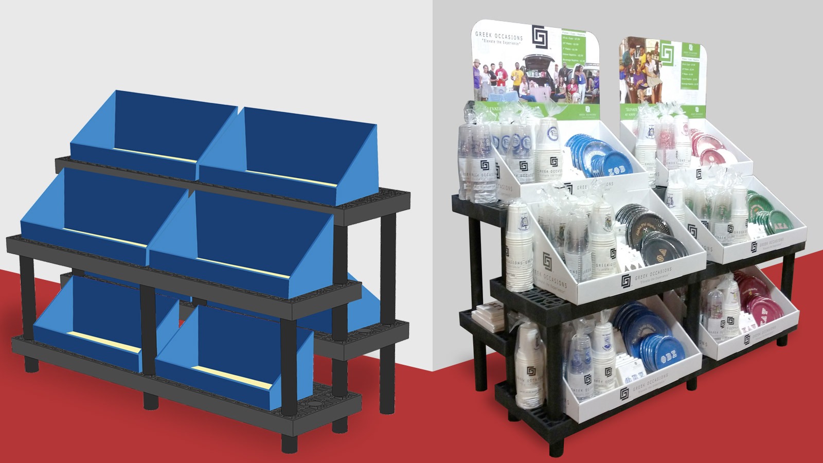
When you have too many products of the same color close together, it is easy for the eye to drift over them. Instead, introduce displays with products displayed in a color grid or pattern to catch the eye. If you look closely, you’ll often see supermarkets doing this, alternating sections of green vegetables with brighter alternatives.
2. Use Contrasting Displays to Make Products Stand Out

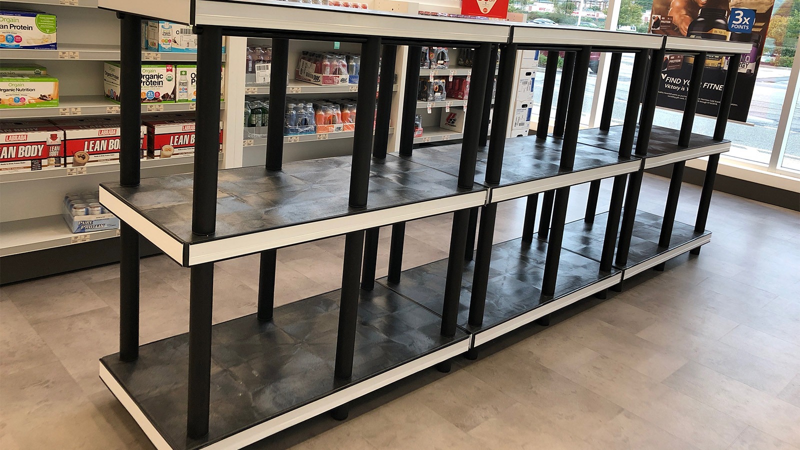
A carefully chosen display can help products stand out. For example, pale items stand out better with a darker display. You can see this in action when supermarkets place fresh bread and pastries on a darker shelf, or when shoe stores place white shoes on a dark or colorful shelf.
3. Displaying Items with Multiple Color Options
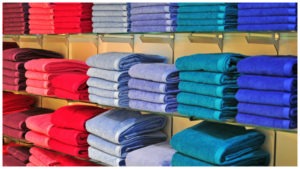
If you are displaying an item with multiple color options (for example, clothes or towels), most customers will instinctively look from left to right, as if reading from a page. Make this easy by arranging the items so that colors transition naturally (red to orange to yellow, for example).
In most cases, starting with a lighter or bright color on the left will help draw them in, although darker colors may work well if this is what is in demand. In winter, for example, clothes stores may want to move darker colors to the left since these tend to be in higher demand.
4. Prefer Neutral Colors for Your Walls and Floor

All these uses of color are for one purpose: to draw the eye to specific products and make them look inviting to customers. Brightly colored flooring and walls achieve the opposite: they distract the customer and overwhelm them. Prefer neutral colors and use brighter colors as accents only.
