Leveraging Visual Merchandising: 3 Tips to Connect and Capture Shopper’s Attention
Retailers confront a significant issue in today’s always-connected, information-rich world: a consumer’s brain can only hold so much information before it becomes overloaded. People’s attention spans are limited, and with the flood of information available to us daily via personal devices, businesses are up against formidable odds to reach and have top-notch customer engagement.
Customer engagement is a critical enigma that all retailers must crack to get the most out of their merchandising efforts.
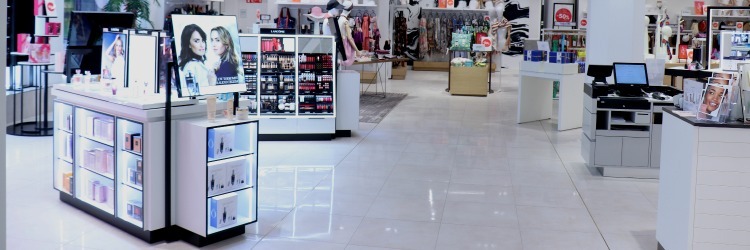
Visual merchandising is an imperative strategy used by merchants to achieve traction with every store visit. This approach helps optimize display arrangement, product presentation, and other features to draw in customers. Successful visual merchandising does not necessitate a large expenditure; rather, it requires some creativity in utilizing items already in your store.
Let’s take a look at a few ways to use visual merchandising to build a brand, boost sales, increase customer engagement, and bring in ROI.
Rearrange the Store Layout
Shoppers frequently overlook 50% of the sales floor. As a result, rearranging the store layout to reduce dead zones and improve store navigation is a crucial first step in achieving customer engagement.
Customers who frequent your store like to see things a little differently each time they come in. While it is a good idea to keep your overall layout consistent, you should switch up the items on display tables and themes to ensure there is something new for your shoppers to explore each time they visit. This consistency allows your customers to be familiar with their surroundings while still being surprised by the departments they visit.
To do this, you may want to consider choosing a layout that will showcase and make products easier to find.
Design the Customer Journey to Highlight Products Effectively
The space next to the cash register or checkout point is one of the most significant areas in any retail store. These displays are referred to as “Point-of-Sale” (POS) displays. While most businesses use shippers or sidekick displays provided by the manufacturer, successful, more aggressive retailers should design their own semi-temporary displays.
Extra display space for specials, clearance, or high-value items is a great way to create and organize flex spaces within your store. This will provide an easy-to-plan way to make the store a little different each time customers visit.
Furthermore, embracing technology is often beneficial. In retail businesses, touchscreens are becoming increasingly common. They pique a customer’s interest in learning more about a product or service you provide. Touchscreens appeal to the senses of sight and sound, aiding in closing purchases.
In designing the customer journey, you may want to consider the following points:
- More emphasis should be placed on the relevance of display position and placement.
- Demonstrate the store’s importance, and place high-value items in the primary zones.
- Emphasize focal point displays that highlight new products and tell a story.
- Place essential items in the store’s back to encourage customers to explore more of the store.
- Allow ample space for clients to browse without bumping into one another.
- Place impulse displays at the checkout area and in the main aisles.

Incorporate Multi-sensory Elements into your Environment
Engaging the five senses is one advantage brick-and-mortar stores have over e-commerce shops. Here’s how you can leverage each sense in your store:
Sight
Visual merchandising is but a nod to the sense of sight. Colors and lighting can help with message retention by emphasizing a key point of interest. Lighting may provide a variety of effects that grab a customer’s attention or influence how they perceive the room as a whole.
Color palettes should elicit a feeling that encompasses the display theme. For example, to highlight the various seasons you would use pastels in spring and bright bold colors in the summer. These color palettes would change with the calendar or the holidays to keep things fresh and interesting for shoppers. Also, keep in mind that you must comprehend color psychology and how it affects a customer’s opinion of the story you are trying to tell.
Hearing
Sounds can alter the mood of customers by creating a vibe within the store’s environment. As a result, businesses can use music and ambient tones to create a climate conducive to ideal customer engagement.
Smell
Smells play a far larger part in visual merchandising than one might expect. Using stories and common histories, you can also leverage the sense of smell to promote various items. For one, you can use scents to elicit an emotional response and tell a story, such as an apple pie to sell ovens or coconut to sell summer swimwear.
Taste and Touch
Customers can get hands-on experience with samples and demos, which can help them make a purchasing decision. As a result, visual merchandising will fall short if it does not appeal to the senses of taste and touch.
Summary
There are three main tips to remember when visual merchandising for any purpose: establishing a brand, enhancing sales, promoting customer engagement, or generating ROI.
To begin, alter the store layout to avoid dead zones and make navigating easier. This navigation option allows your consumers to be aware of their surroundings while still being surprised by the departments they visit.
Second, create a customer journey that effectively highlights products. Using the store’s space and POS to sell and display things on sale or clearance, as well as smaller, high-value items, can be a fantastic subtle call to purchase.
Finally, include multi-sensory aspects in your environment. One benefit brick-and-mortar stores have over e-commerce is that they contain the essence of visual merchandising by engaging the five senses.
Every customer-facing part of your organization is affected by visual merchandising. Visual merchandising is much more than arranging things in an aesthetically pleasing fashion. It includes everything from your brand identity to customer engagement and experience to sales. With all of the strategies and tricks discussed in this article in mind, you will be able to design a storefront that is not only attractive but also reflects your company’s values and the experience you want to provide your clients.
Get started today on optimizing the layout and design strategy of your storefront to ensure you’re maximizing the value of every customer who walks into your business. Need a hand? At SPC Retail®, we offer a free, NO obligation, layout and design consultation. Fill out our consultation form and a member of our Design Lab team will contact you to discuss how our SPC Retail® displays will fit into your layout strategy!


