How to Use Impulse Displays: A Guide for Store Planners
Webster’s dictionary defines impulse as “a sudden, spontaneous inclination or incitement to perform a usually unpremeditated action.” As humans, we tend to plan our actions, purchases, and decisions. But since we’re also emotional beings, we also make decisions based on how we’re feeling in the moment. Store Planners can use this to their advantage by creating impulse displays that pull shoppers into the moment.
Impulse goods are products that people buy on a whim. To make them appear more attractive, most impulse displays do one of three things:
- Offer a great price on an item
- Remind the customer to purchase something they might need or have forgotten
- Encourage add-ons that work with a variety of items in your store
Here’s how you can use impulse displays in your merchandising strategy to increase revenue and provide more value to your shoppers.
Why are Impulse Displays Important?
Retail studies show that customers only take in 1% of what they see in a store. It’s much like a reverse “can’t see the forest for the trees” situation: We see the store broadly but not all of the fine details inside it.
But details are important. Seeing is buying, especially when it comes to impulse items. Getting customers to see a product is the first and most important step in selling items on a whim.
Impulse purchases account for a significant chunk of the consumer spending pie. According to a study by Marketing Support, Inc. and Leo J. Shapiro and Associates, about one-third of all consumers make a sizable impulse buy every week, with a median purchase of $30. That’s a lot of money for retailers to leave on the table, which is why integrating impulse displays is a must.
How to Incorporate Impulse Displays
Part of increasing visibility for impulse items means placing merchandise where customers are sure to see it. Here are some creative ways to use impulse displays without coming across as salesy or pushy:
Create Guideposts
Use impulse displays as beacons throughout primary aisleways to guide and direct shoppers throughout the store. For example, a big box store could place an impulse display showcasing DVDs next to the electronics department in the main drag aisle. Or, a supermarket might put a cookie display next to the snack aisle. It’s like offering a preview of what else is in the area.
Choose Strategic Locations
An impulse display in a corner is not going to have the same effect as one in high-traffic areas. Ensure impulse displays are always placed front and center in areas where shoppers spend the most time.
Cross-Sell
Display relevant items and accessories close to top sellers. Convenience can go a long way in encouraging shoppers to scoop up a few extra items.
Shine Bright
Impulse displays require the same thought and consideration as the rest of your store’s decor. They should be prominent within the space and use signage to draw attention.
Provide Value
Successful impulse displays create the idea that the customer is being offered something they may not get anywhere else. This increases the impulse items’ perceived value, whether it’s money or time saved, unique experiences, or convenience.
Example Areas in a Store for Impulse Displays
Let’s put all of this information together and create some actionable examples that you can implement.
Impulse Zone 1: Decompression Zone
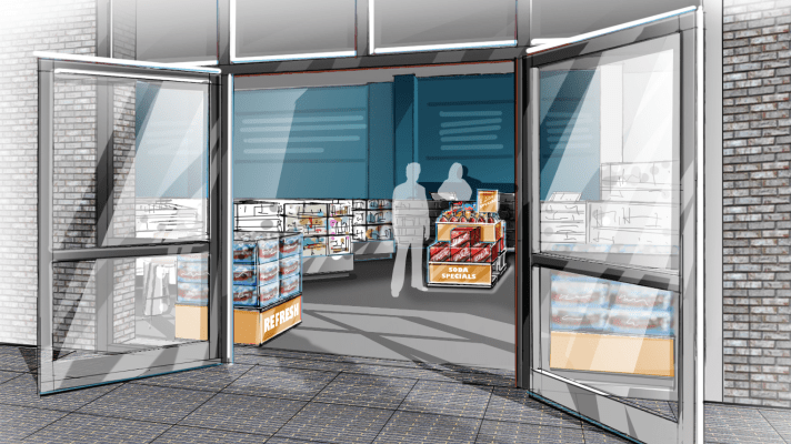
The decompression zone is the first 5 to 15 feet of your store, where the customer transitions into shopping mode. While some argue that this area of the store is often overlooked by shoppers, to others it’s a goldmine for finding new products, deep discounts, or everyday necessities.
Displays to use:
- Bulk Stack – a quick solution for displaying large quantities of product
- Focal Cluster – a collection of displays used to tell a story (Bonus: great cross-sell opportunity!)
- Product Showcase – Used to create a product vignette on a platform display to tell a story, often used in home decor stores and fashion retail.
Impulse Zone 2: Power Aisles
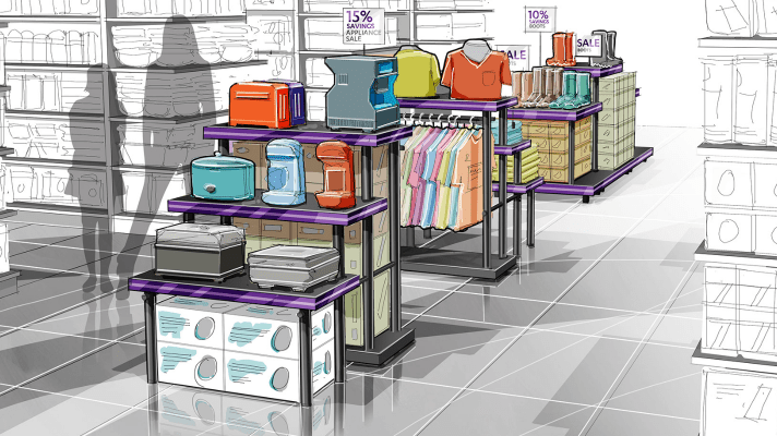
A power or action aisle is a wide and spacious main path throughout the store. This path improves the overall experience by ensuring shoppers can easily maneuver shopping carts and navigate their way through the store. Using impulse displays here can highlight featured products within a category.
Displays to Use:
- End Caps – showcase what someone can expect down a particular aisle.
- Dump Bins – great for grab-and-go items like snacks or bulky items, ideal for grocery stores, pet stores, or deep discounts.
- Temporary P.O.P. – clearance tables or temporary P.O.P. displays are ideal for rotating promotional needs. These can be sponsored by brands or a place for product overflow.
Impulse Zone 3: Seasonal
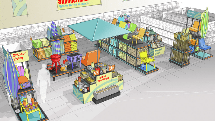
Seasonal displays play an important role in promoting impulse buys. With retailers celebrating 13-20 seasons a year on average, seasonal displays are filled with impulse opportunities, from entire departments or a single display.
Displays to use:
- Gondola – typically a pairing of a flat base and a vertical component. It’s a versatile display that can accommodate large or small items, perfect for rotating merchandise.
- Specialty Carts – a specialty display that brings hard-to-merchandise product off back walls and into primary aisles. Think items like tiki torches, umbrellas, yard tools, rugs, etc.
- Platform – platforms help showcase the season and “bring it to life” for the customer. They’re also a place for stocking large quantities of “it” products of the season.
Impulse Zone 4: Checkout Lane
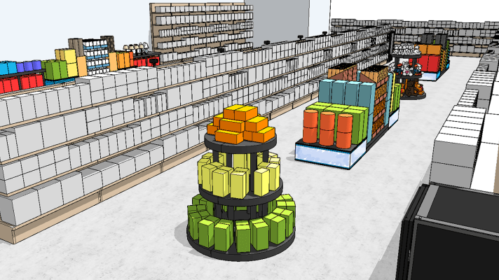
Placing impulse items at the checkout is the most common method of maximizing impulse buying. Each retailer has a different checkout experience: standard lanes at a grocery store or carousel lanes at large-format specialty stores like Home Goods or Michael’s, for example. Store designers should choose displays that are proportional to the space — smaller lanes will call for smaller displays, while larger lanes can make room for larger displays.
Displays to use:
- Round – provides 360-degree shopping. Customers can see and shop for products no matter what direction they are coming from. These are best used in larger format checkout lanes or in the main aisleways adjacent to the checkout area.
- P.O.P. – small footprint single-use cardboard displays are simple and easy to set up without taking up much space. They’re typically branded and designed to capture attention. Place these at the start of a checkout lane.
Need more inspiration to maximize impulse buying? Reach out to SPC Retail for more ideas, tips, and solutions.
