7 Store Layout Mistakes Retailers are Making
Your retail store layout has a lot to do with your top-line sales and bottom-line profits. It should be designed to guide shoppers through your store and help them find what they need. And when done well, your layout can highlight important products that will increase your sales volume.
But designing an effective store layout isn’t just about visual appeal. It’s also about functionality and psychology that considers how people shop. Some retailers know how to blend all of the above, while others have some work to do in this area.
Here are the top seven mistakes retailers make when creating a store layout and how to correct them.
1. Choosing the wrong floor plan
The wrong floor plan can completely change the vibe of your store. It sets different expectations for your customers and can even confuse them as they try to locate specific products. As a result, this can discourage them from visiting the store in the future, which makes it hard for retailers to reach their business goals.
The Solution: Choose a suitable layout for your type of business, the size of the store, and your operational goals. Matching the layout to your store type meets customers’ expectations and creates an overall better experience.
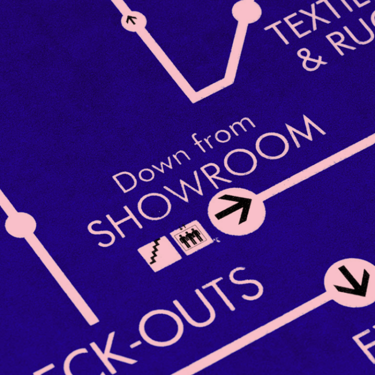
2. Having a complex or disorganized layout
Having a hard-to-navigate store can confuse and frustrate customers. It makes customers work harder to find what they are looking for, feel like they’re in a maze, and distract from their shopping goals. As a result, they’ll end up spending more time trying to navigate the store and less time exploring your merchandise.
The Solution: Store navigation is an essential aspect of customer satisfaction. Thinking logically about your floor plan and navigation signage will help reduce customers’ stress, promote convenience, and foster customer loyalty.
3. Having too much or too little merchandising space
Space has a lot to do with shopper psychology. For instance, you’ll notice in high-end retail stores that expensive items are given more display space, while bargain items tend to be grouped closely together.
However, you also need to think about functionality and shopability. Having too little space to display products can mean not having the products customer need or want in stock. You might also be limited in terms of variety. On the flip side, having too much merchandise space can become a financial burden to keep shelves looking full.
The Solution: Retail space is all about balance. Before designing a space, consider your inventory, price points, and ability to receive and manage products so you can properly allocate space for fixtures, displays, and inventory.
4. Lacking design cohesiveness
Being too eclectic with display styles and types can detract from your store’s ambiance, brand image, and overall shopping environment. You want to create a cohesive image so that customers will know what to expect over time.
The Solution: Some variation is good. But you also need some sort of cohesive element that runs through the entirety of displays. Ideally, your design choices should reflect your brand.
5. Lacking flexibility in design and displays
Stores tend to maintain the same vibe long-term, but that doesn’t mean they’re completely static. Refreshing your layout by switching display locations keeps your store engaging.
It’s important to use a variety of displays in your store layout (without going overboard, of course). Without variety, stores often lack visual interest.
The Solution: Use a mix of displays (tables, platforms, shelving, etc.) that offer modular capabilities and can be changed as needed. This allows you to accommodate new types of merchandise that don’t fit existing displays without reinventing the wheel.
6. Blocking sightlines
Blocking a customer’s view with tall displays or poorly placed aisleways in the front of the store will hinder their ability to decide where they need to go next. Customers need a clear view of the store from the moment they step inside, since not everyone will take the same path through your store.
The Solution: Be mindful of the eye level of your potential customer. Think of what you want them to see – both as they enter and exit. Use shorter displays towards the front of a sightline path and taller displays towards the back. Keep the most relevant products on that sightline so customers can quickly process where important items are located.
7. Overcrowding aisleways with P.O.P. displays
Having too many displays in aisles can make it difficult for customers to pass through comfortably. It can also make customers feel overwhelmed, which fails to encourage impulse buys.
The Solution: Use appropriately sized displays that don’t block the flow of traffic. Limit the point-of-purchase (POP) displays to keep aisles clutter-free. Less is more!
Which of these seven store layout mistakes are you guilty of? When we know more, we can design better — discover our retail display solutions to improve your store’s appearance and sales!