5 Ways Point of Sale Displays Can Pull in More Traffic
As more retail stores have to upgrade their marketing tactics to attract today’s shopper, it’s clear that the point of sale (POS) is one of the most important pieces for investors and retailers to pay attention to. From modular retail displays to more traditional display stands, it is possible to attract more buyers to your business and products.
Here are five ways to optimize your POS so that you guarantee more satisfied customers, and more sales.
1. Connecting Online Presence With In-Store Experience

Nowadays, it’s rare to find a buyer who hasn’t first looked at the product and store reviews before going out to purchase the item. Retail News tells us that many consumers will only trust the companies who have a strong online presence. One way to connect the online presence with the in-store retail experience is to include QR codes on the display graphics of your point of sale. This directs buyers to your website, where they can later get more information or become part of your newsletter list. Once on your website, they can also find more about your exclusive deals, and you build up a following of online customers.
2. Curbside Appeal

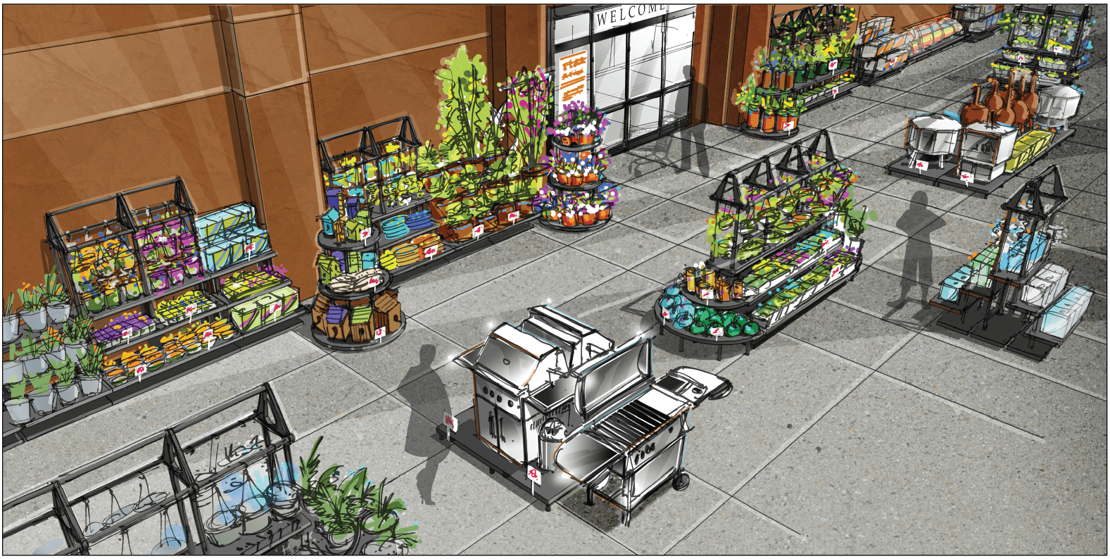
How do you advertise in a more appealing way? Curbside signs and displays catch a shopper’s eye instantly. To draw customers in, make sure your signs are attractive. If your store has large windows, it’s important that sightlines into the store are intriguing and showcase what products shoppers can expect to find. Additional elements at the curb, such as witty messages, seasonal products, hosting special events and temporary pop-up shops will peak curiosity, pull shoppers in and generate visual excitement and interest.
3. Convenient Store Layout

Your store layout must be highly organized and encourage strolling. If it has visual appeal and helps the customer to navigate their way around easily without getting lost or confused, they’ll have a more fun time in your store, stay longer, and likely find something they will want to purchase.
Pay attention to your threshold, say researchers at Shopify. It’s the first space your customers and potential buyers set foot in as they enter the store. The three things to focus on here are good lighting, proper display and color schemes. Did you know that 90 percent of customers subconsciously turn to the right when entering a store? Tie this into your layout planning by making sure the first impressions as they turn in that direction are pleasant ones.
4. Sales! Sales! Sales!

Whether they are value customers or not, people are more likely to go into a store when sales are clearly advertised. Sales can incorporate visual stimuli. The color red is known to grab a person’s attention or cause them to look closer. Also grab their attention with call to action signs — “limited offer” or “buy now” can encourage them to make a decision on the spot. A case study by ConversionXL showed that it was possible to increase sales by 332 percent with this sense of urgency portrayed in a POS.
5. Mobile Payment Solutions

How digital is your point of sale? How connected are you to your customers and are you attracting them on a daily basis? It is possible to do this by offering mobile payment solutions, so that buying is easy, right at the tip of their fingers. As the increasing trend to use mobile banking and credit cards grows, retailers need to keep up with new technology and raise their digital standards.
For more tips on better retail sales and practices, follow our blog and updates.


