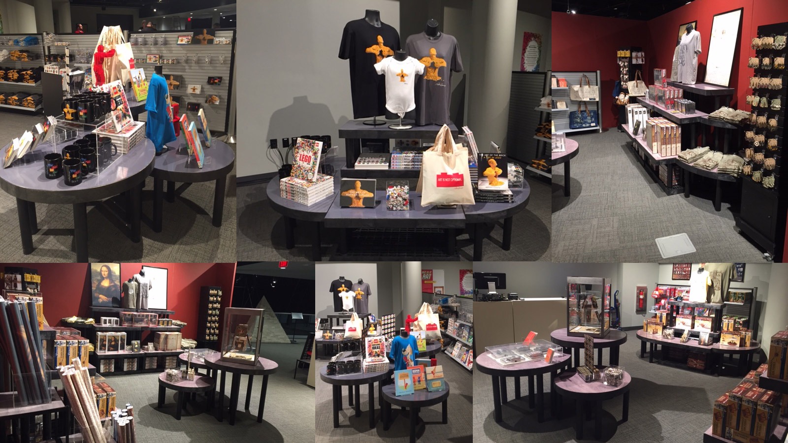
3 Rules to Maximize Your Layout Design
When it comes to your store or garden center, there’s no denying the role that retail design and layout play in terms of success.
Although many shoppers have moved online in recent years, research shows that nearly 80 percent of those surveyed still shop in brick and mortar stores. That is why when store planning you need to strive to improve customer loyalty by providing an excellent customer experience.
While there’s a lot to consider, there is most certainly a method to the madness. It’s time to be strategic!
Consider These 3 Rules When Planning the Layout and Design of Your Retail Store
When you’re faced with a big task, such as the revamping of your garden center, research shows that it helps to break that large task down into more manageable parts. Your brain works better when it can focus on specific goals, which is why rules are so beneficial — they allow us to break down overwhelming tasks into key milestones.
As reported in one study, it was found that more than 80 percent of all nursery sales were from repeat customers. That is why you need to prioritize the customer experience. As you improve the layout and design of your store, this will result in greater customer loyalty.
To assist your efforts in relation to layout design, consider the following three rules.
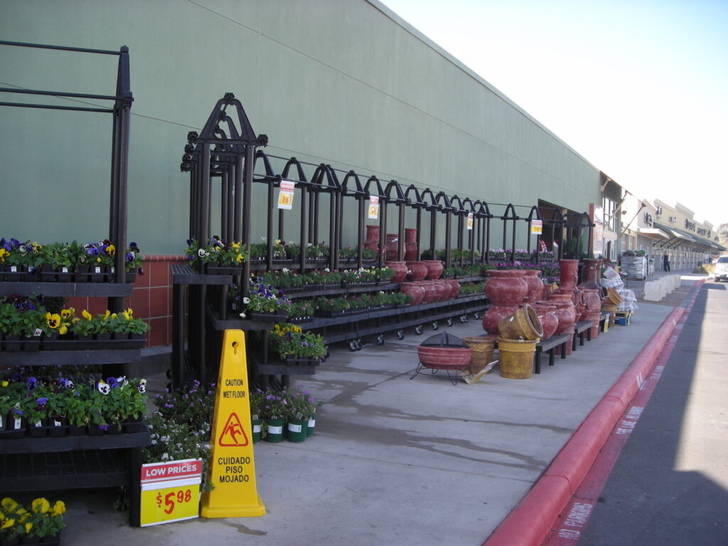
Rule One: Stimulate Visual Excitement
One of the best ways to create a memorable experience is to create a story — one that represents your brand. This will help engage shoppers and improve traffic flow. One of the best things about telling a story through visual merchandising is that it increases interest and encourages up-selling. Focal points increase sales by up to 229 percent, so be strategic with how and where you direct shoppers. Also, be mindful of the “decompression zone” — the area where your customers transition from the outside into your store. This will be your opportunity to really introduce your brand.
Tip: To get started, eliminate monotony and flatness. This can be achieved by adding varying fixture heights, as well as different configurations to break up long runs. Also, keep it seasonal when possible, freshening up your displays regularly.
Rule Two: Maximize Sightlines and Views
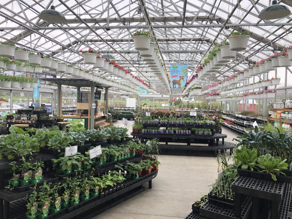
If shoppers are unable to see merchandise, how will they buy it? To maximize the layout of your store and create a positive shopping experience, maintain clear sight-lines. This will maximize exposure, highlighting the products you offer. As many experts say, where your eyes go, your feet will follow. Although you’ll want to ensure your products are visible, don’t be afraid to use curves and angles, leading your customers’ eye down a promising and immersive path.
Tip: When designing your layout, plan from the eyes of your customers. Think about how they’ll experience your new layout, organizing your products in a more strategic manner.
Read more: 5 Tips for Better In-Store Product Visibility
Rule Three: Organize, Define, and Control Traffic Flow
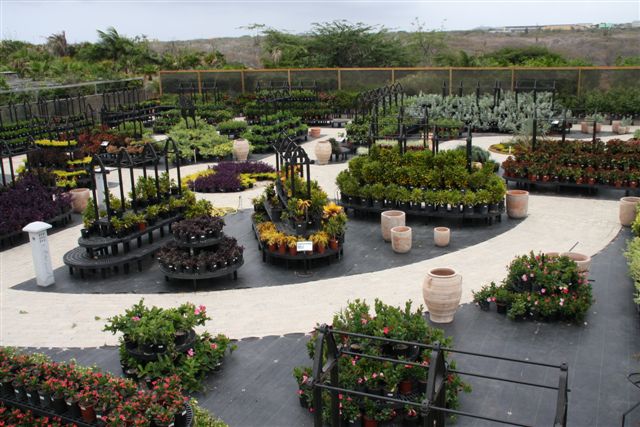
From start to finish, your customers’ experience should be flawless. To eliminate confusion, it’s important that you define an effective, well-planned circulation pattern. Make it easy for your customer to navigate your store, moving from one area or display to the next.
You want your customers to walk through your store and feel inspired. There are a variety of retail floor plans and concepts that will influence traffic. The best option for your store will depend on numerous variables, including the geographic location and size of your retail store.
Learn more about the benefits of a well-thought-out layout and design here.
Tip: Plan ahead, thinking about the most predictable pathways. Then, plan well-designed merchandise areas based on the flow of traffic. Once you make changes, be sure to observe customer flow and behavior.
Ready to Get Started?
At SPC Retail, we’ve created a guide to assist in the planning process.
The first section highlights some of the most important questions you need to ask. These questions will act as your guiding light, inspiring new ideas and goals. Remember, you want to stand out based on your unique brand. Breaking the process down into simple questions will help you dig deeper.
The second section covers some of the most common layouts, as well as unique design challenges. Whether you’re dealing with structural poles or small spaces, we offer tips and suggestions to help you maximize your layout.
Last but not least, we’ll guide you through real-life before and after case studies.
Get your copy of the Layout and Design Resource Guide today — download here!
