The Basic Principles for Design and Visual Displays
Picture your favorite store. Perhaps you’re the outdoorsy type who could spend hours in a Gander Mountain moving down the racks of clothes followed by a stroll through the outdoor camping gear. Maybe you know the joy of grabbing a Starbucks as you peruse through the aisles of Target, drawn to the colorful designs that tell stories of faraway beaches, serene forests, or Fourth of July fun with the family. A great display attracts shoppers like a magnet and persuades them to make a purchase. So, what is the big secret for turning a generic display into an attention-grabbing showstopper and how does it bring shoppers through your doors?
Believe it or not, all you need to do is to go back to the basics. The eight basic principles for design, that is. By understanding shape and rhythm, you can balance your merchandise using repetition, dominance, movement and even color. These principles create the perfect visuals that will bring shoppers running to your registers!
Time to Shape Up!
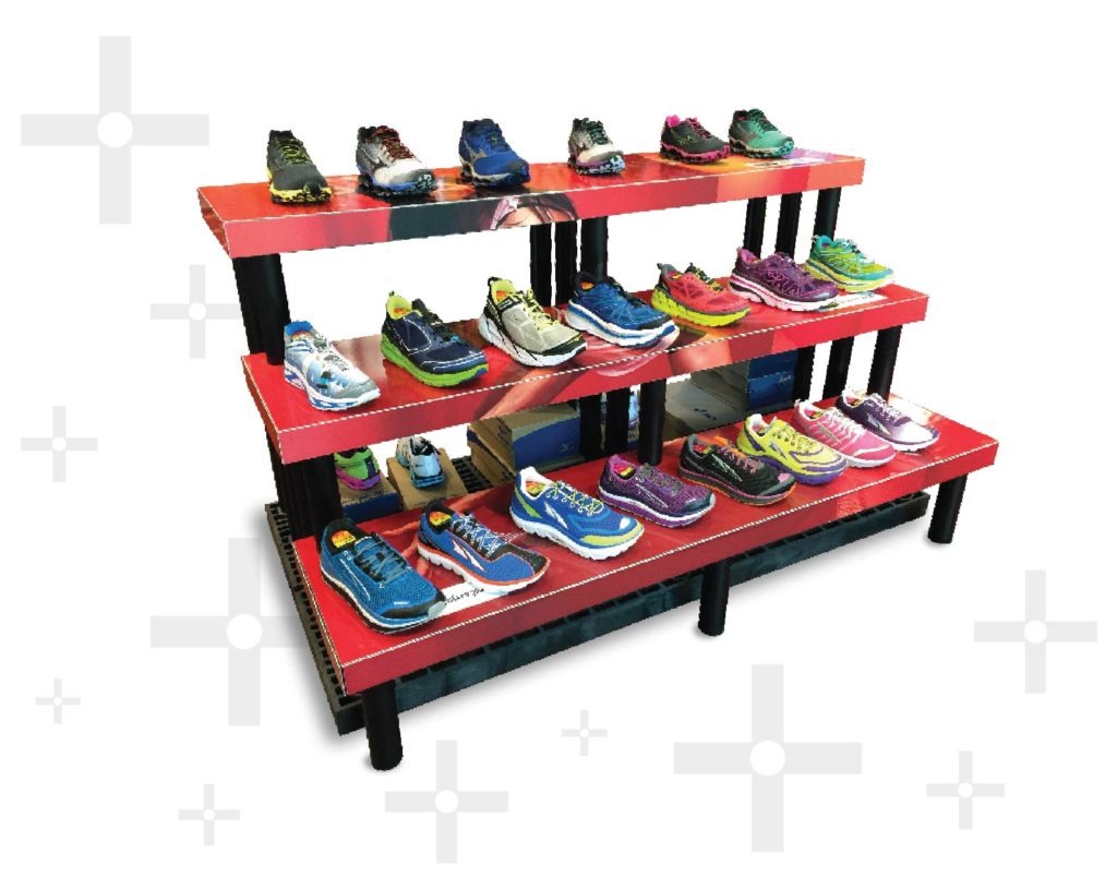
Let’s talk shape, the first basic principle. Shapes are defined by boundaries that place an emphasis on the products. Think of your display as a shape and consider how each distinct product interacts with it to create the full visual. The shape can affect display placement as well, a bigger shape draws more attention and can hold more products. Therefore, large shaped displays are normally staged in the middle of the floor to attract more customers while smaller displays line end caps and registers. You can incorporate shapes for the ultimate design layout. There are a variety of different shapes to choose from, but the most popular include; single unit, pyramid, steps, fan, the classic line, and grid format.
SINGLE UNIT:
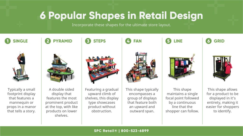
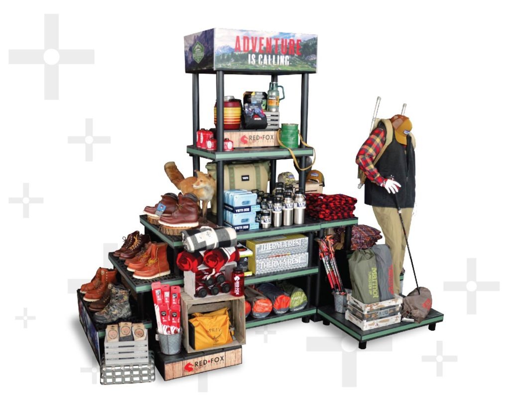
The most common single unit will generally incorporate a mannequin. This fundamental prop features the product in a manner that tells a story to the shopper, one where they are benefiting from their purchase. Take a look at the example above, the hiker mannequin is sporting a plaid shirt and vest ensemble with khakis. At his feet lie complimentary products that are grouped in the same category. The display sparks a shopper’s imagination by helping them to envision themselves as the hiker, trekking through the forest. Give shoppers the, “Once upon a time . . .” and let them fill in the rest of the tale with a purchase, or two.
PYRAMID:
You can never go wrong with the iconic pyramid shape. Certainly, one of the longest running trends every retailer should take advantage of. Turns out the Egyptians were on to something in 3000 B.C.!
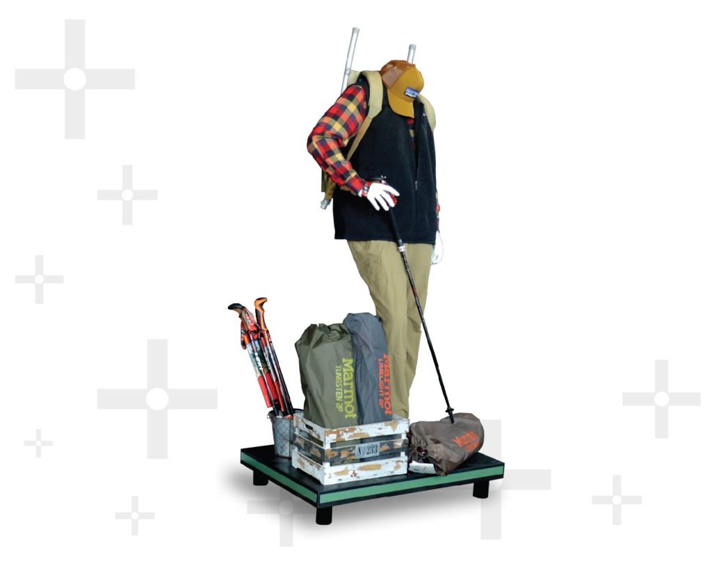
The merchandising strategy behind this shape is to place the most important and interesting product at the top, to act as a focal point and be the first item shoppers see. The other products step down from that point, and the shopper’s gaze will automatically shift down the slope. In the example above, the pyramid highlights what shoppers can expect by creating a vignette on the top shelf. The remaining lower shelves act as a shelling or storage space. By incorporating into a display different levels you can easily pique visual interest.
STEPS:
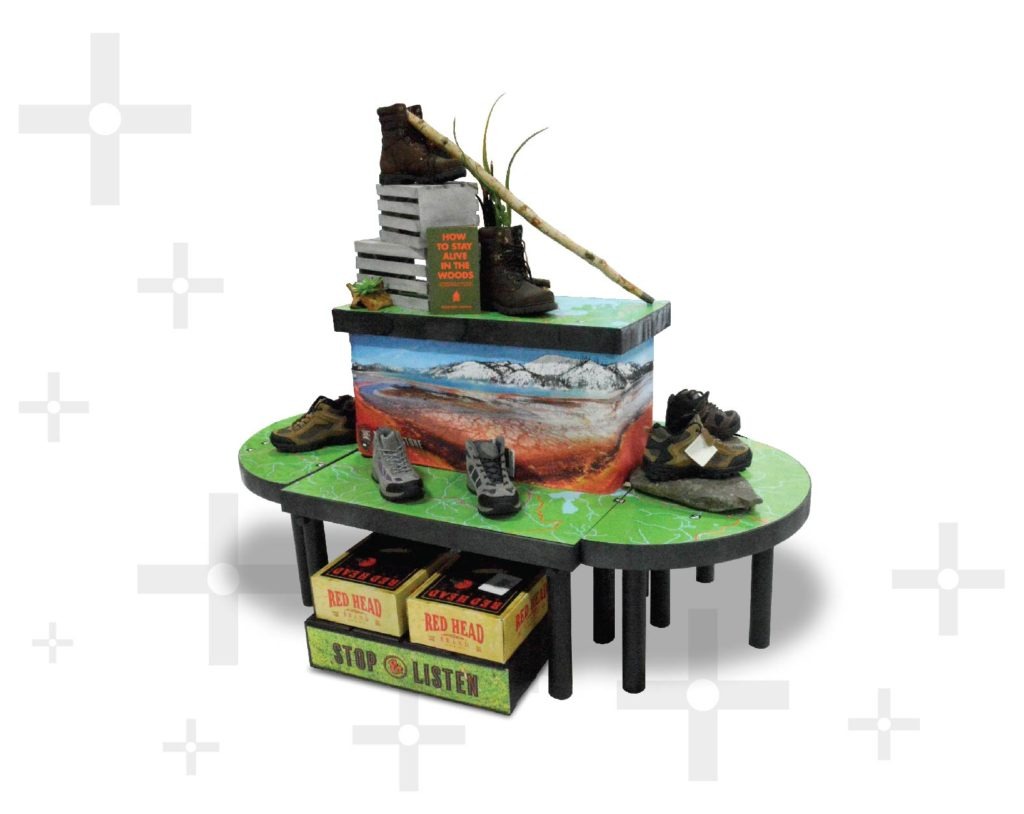
Think of the iconic scene in Rocky at the top of the stairs. His gradual workouts payed off and so will this display. The display example above features a gradual upward climb of shelves. Similar to a pyramid, the top products will attract shopper’s attention first and their eyes will scan down the display. This example also utilizes proportion, a principle discussed later in this article, which gives shoppers a better view of the products on each shelf. Get extra creative and incorporate mannequins climbing or sitting on the steps to attract more attention and draw in foot traffic.
FAN:
While a steps shape moves upward, a fan shape moves outward. Picture a peacock spreading out their feathers. In the example above, the tower display acts as the central point. This part of the display is a solid structure that showcases smaller products, tells a story, and incorporates theme branding. Multi-level shelves or tables fan out around the tower to create a display with reach and height. What attracts shoppers is the radiating merchandise around the solid display. Items are easier to access and see which encourages hands-on interaction.
LINE:
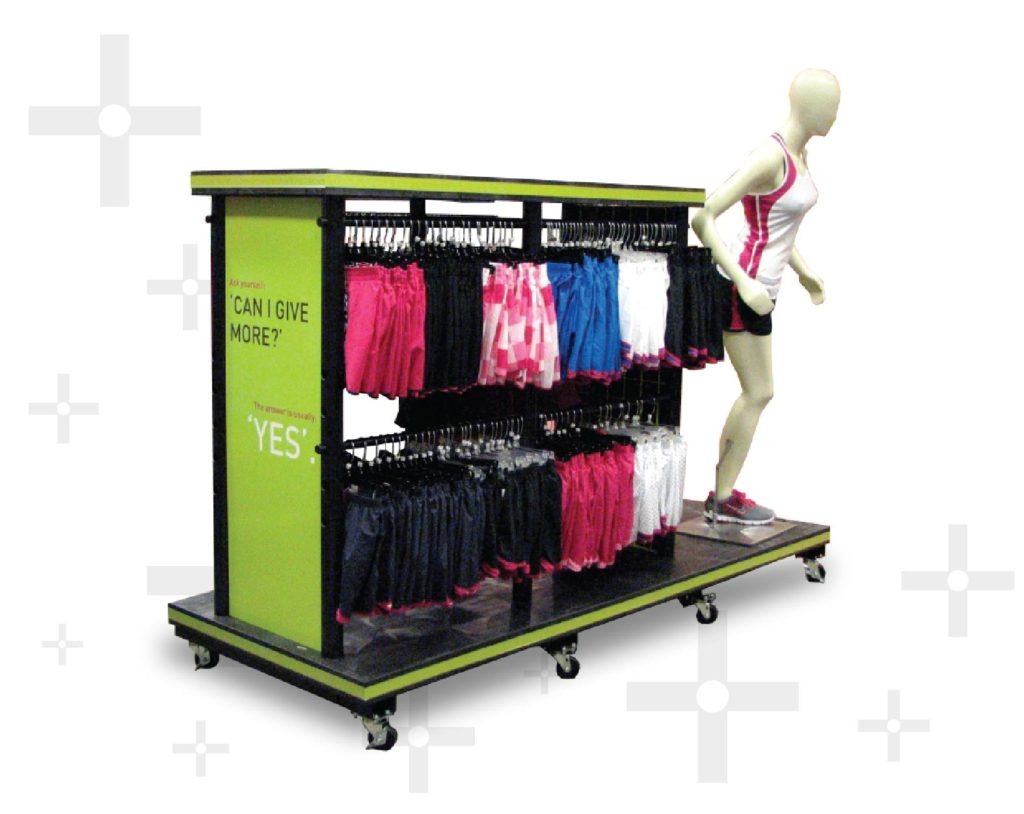
Some visuals take on the classic line. Whether straight or curved, lines create a clean look for your store layout. Lined displays are used to direct your shoppers though the store. Like subtle arrows, they will have a single focal point with a line that extends toward a destination. In the example above, the focal is the mannequin which helps shoppers envision themselves sporting the active wear. The mannequin is followed by the line of merchandise that directs shoppers down the rows to the showcased product. Lines should also lead your shoppers to their final destination, the register.
GRID:
Everything has a place, and everything is in its place with the grid format. This shape allows you to hang products and create dimensions of height, while displaying merchandise in its entirety.
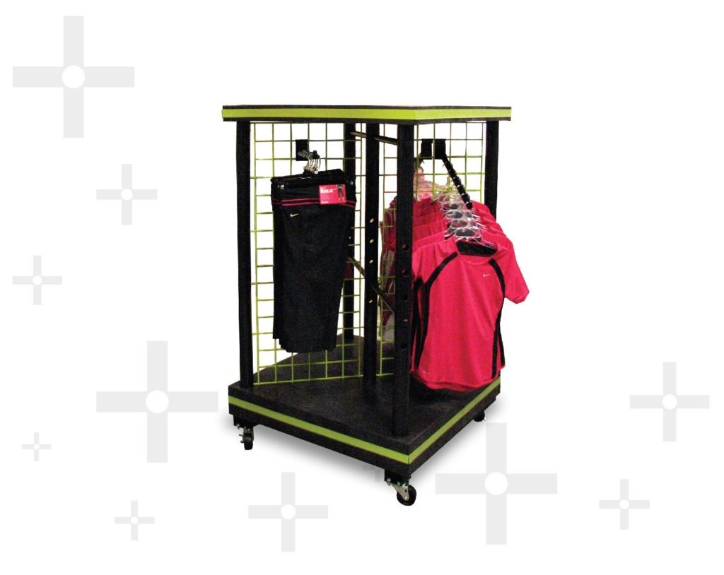
In the image above, the grid display is a smaller twist on the traditional grid wall. It allows for you to display outfit pairings while still maintaining full product visibility. For additional add-on-sales, hang coordinating accessories to inspire a shopper on how to create a complete ensemble.
A Little Feng Shui
In conjunction with determining what shapes to use, you must consider the next four principles; Balance, Proportion, Dominance, and Repetition.
Balance is the amount of space between items and the visual weight of the objects. With any display, the only way to achieve balance is to imagine a vertical line down the middle of the display. Look to the right of this mental line and take stock of the visual volume of your merchandise. Now look to the left, the two must be equal in visual weight. Meaning, the merchandise is equally spaced and the amount of product shown is roughly the same. This style of display is using symmetrical balance, resulting in a formal and harmonious look that easily registers with shoppers.
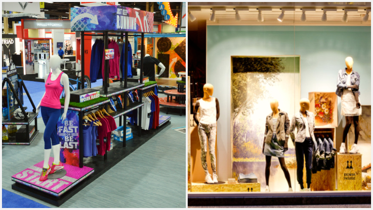
There is a second type of balance that leans toward the more creative side of design. Look at the image on the right, showing a window display from Street One Fashion Co.The three mannequin units are grouped to one side while on the other, a single mannequin stands alone. This set up is termed asymmetrical balance. If you were to draw your mental line again you could easily compare the visual weights on each side. The visual weight of the right side attracts attention first and directs the shopper’s gaze across the span of the entire display. The single mannequin is not overshadowed because she is placed at nearly the same height as the tallest point on the right. Together, the sides are still harmonious, and the display attracts shoppers through its unique layout.
While balance is all about the spaces between, the Proportion principle requires you to assess the space around your merchandise compared to the overall size of the display. The ratio of the items must equal the whole display.
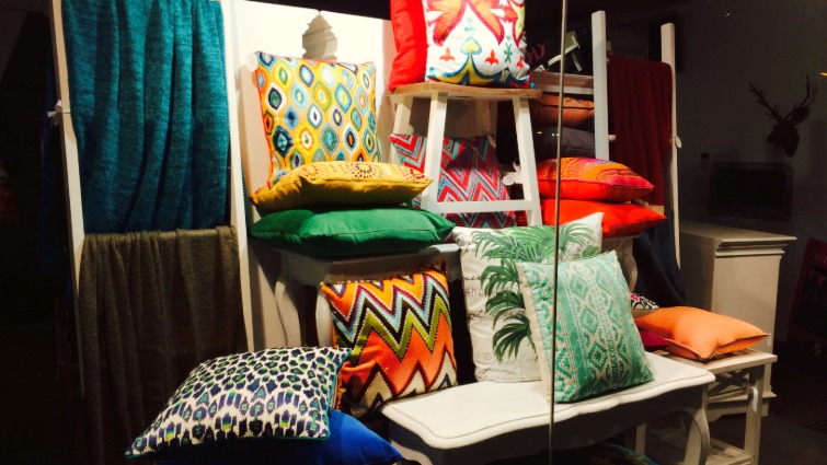
The best way to visualize proportion is to look back at our pyramid shape. As you stack your products on one side the space around them must be the same on the other side. In the example below, the pillows are all similar in size and shape. The display stools are filled neatly by the pillows without making them look small. Play off the size and shape of your displayed products to evoke interest. Proportion is crucial for store window displays, remember that shoppers are always in a hurry and you have a few seconds to capture their interest as they pass.
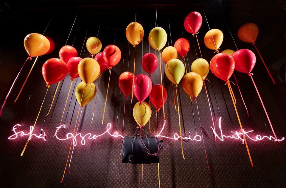
When an isolated product becomes the highlight of the display it is utilizing the principle of Dominance. Dominance is often used for window displays. It demonstrates to shoppers that the featured product is important and deserves their attention. In the example below, the purse takes center stage while lighting emphasizes the red color. The dramatic appearance of the overall display makes shoppers take notice and consider making a purchase.
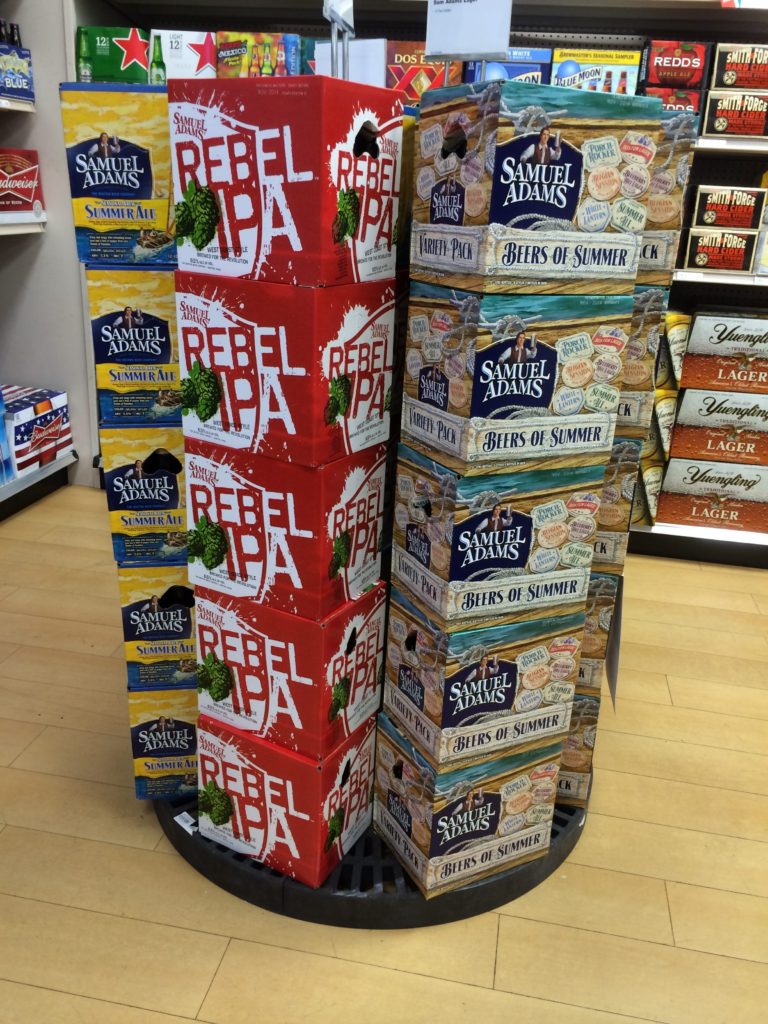
Dominance is excellent for high end and flashy merchandise, while the principle of Repetition is better suited for casual merchandise. Repetition is the duplication of a product throughout the entire display. In the photo below, the cases are categorized by type, and repeated upward around the platform. By repeating the merchandise in aligned stacks, the impression of the product is stronger and invites shoppers to share in the unity of your store’s brand design. Repetition can be used on a variety of display shapes, but it works best with lines and pyramids.
Follow the Flow
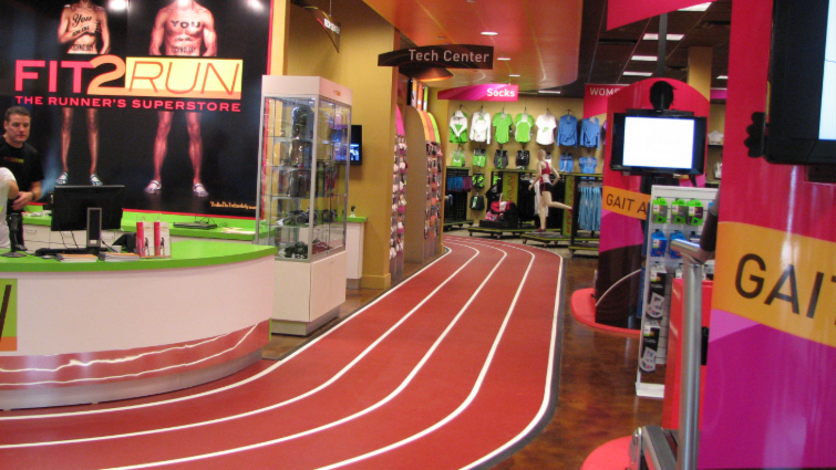
Different designs create Rhythm as our eyes move across the visual. Similar to repetition, rhythm creates a beat when repeated. Like a hook in a song, the elements will work together to create a message that resonates with shoppers. In the example below, the displays create motion as the shopper’s eyes follow the path of the track. The movement is natural and logical for shoppers to follow, ushering them around the store.
For more information on store traffic patterns and fixture placement, check out our blog post “Tips for Using Retail Fixtures Effectively.”
Get a Move On
Seeing something in motion while surrounded by of immobile displays draws attention and brings shoppers in for closer examination. Making merchandise move or spin on a display is the principle of Movement. This principle can take on many forms including a spinning sign, interactive VR or tech screen with moving graphics, or artistic representations of movement.
A Splash of Color
The final principle, Color, will create the lasting effect on shoppers. The combinations chosen for your display must fit within your store’s brand identity and should complement the merchandise you place on it. Colors can be used to evoke different emotions. For example, warm colors; reds, oranges, and yellows create a cheery and inviting feeling. Meanwhile, cooler colors; blues and greens, even purples and blacks are more relaxing and tend to appear more spacious. For more on using color effectively, check out our blog post “How to Use Color to Improve Sales in Your Store.”
That’s the Principles of the Matter
Together these eight principles are used to create visual masterpieces that enhance your store. Start with a shape, be it a pyramid or a line. Then consider the balance and proportion of your merchandise and the display sizes. Get a good rhythm so your store has a flow that directs shoppers. Consider whether your display will utilize dominance for a feature item or if you want to incorporate repetition using merchandise. Remember, to make it pop by adding movement to your display. Of course, be sure to use colors that represent your brand and spark feeling in your shoppers.
There you have it! You will have shoppers strolling through your doors in no time, eager to check out your displays and buy something new. Just stick to the basics and you will have success! If your interested in learning how we can help incorporate these principles in your displays, contact us at 800-823-6899.
