Tips for Using Retail Fixtures Effectively
The goal of using visual merchandising is to convince your customers to purchase your products or services. A large part of your displays will involve using retail fixtures to enhance the visualization. To avoid creating one-dimensional displays, use retail fixtures to create depth and height for appealing visuals. The tips below are a few ways you can use retail fixtures effectively.
Keep Fixtures Up to Date
If your visual merchandising displays look old and dated, chances are your customers will not enter your store. Instead of using standard, bland metal shelving to present your products, invest in new retail fixtures to increase sales. No-tool retail fixtures are great choices to allow you to set up your display easily and in minutes. This will help to keep your displays fresh and interesting.
Your merchandising display should also reinforce your brand, create awareness and promote loyalty. Brand identity should be consistent and reflect your brand’s look and feel. This can be achieved by implementing graphic integration with your fixtures by using sign kits.
Improve Store Traffic with Fixtures
Your customer’s shopping experience can be enhanced by using the right fixture layout. Your retail fixtures should allow for comfortable browsing while also maintaining visual appeal. Fixtures can help to provide maximum exposure to your most valued merchandise and encourage purchasing.
Here are some suggested layouts to use:
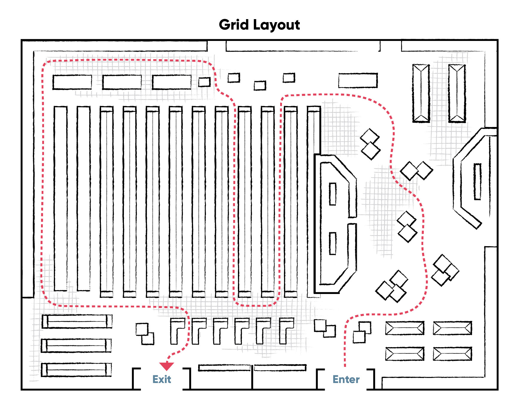 The grid layout is a linear design using long freestanding fixtures to create aisles. It is well suited for small to medium-sized stores, such as grocery, drug, or hardware. This layout accommodates fixtures that can stock high quantities of products, minimizing the need to constantly replenish items. Make sure to include effective signage and a visual merchandising strategy to avoid creating a monotonous or lackluster atmosphere.
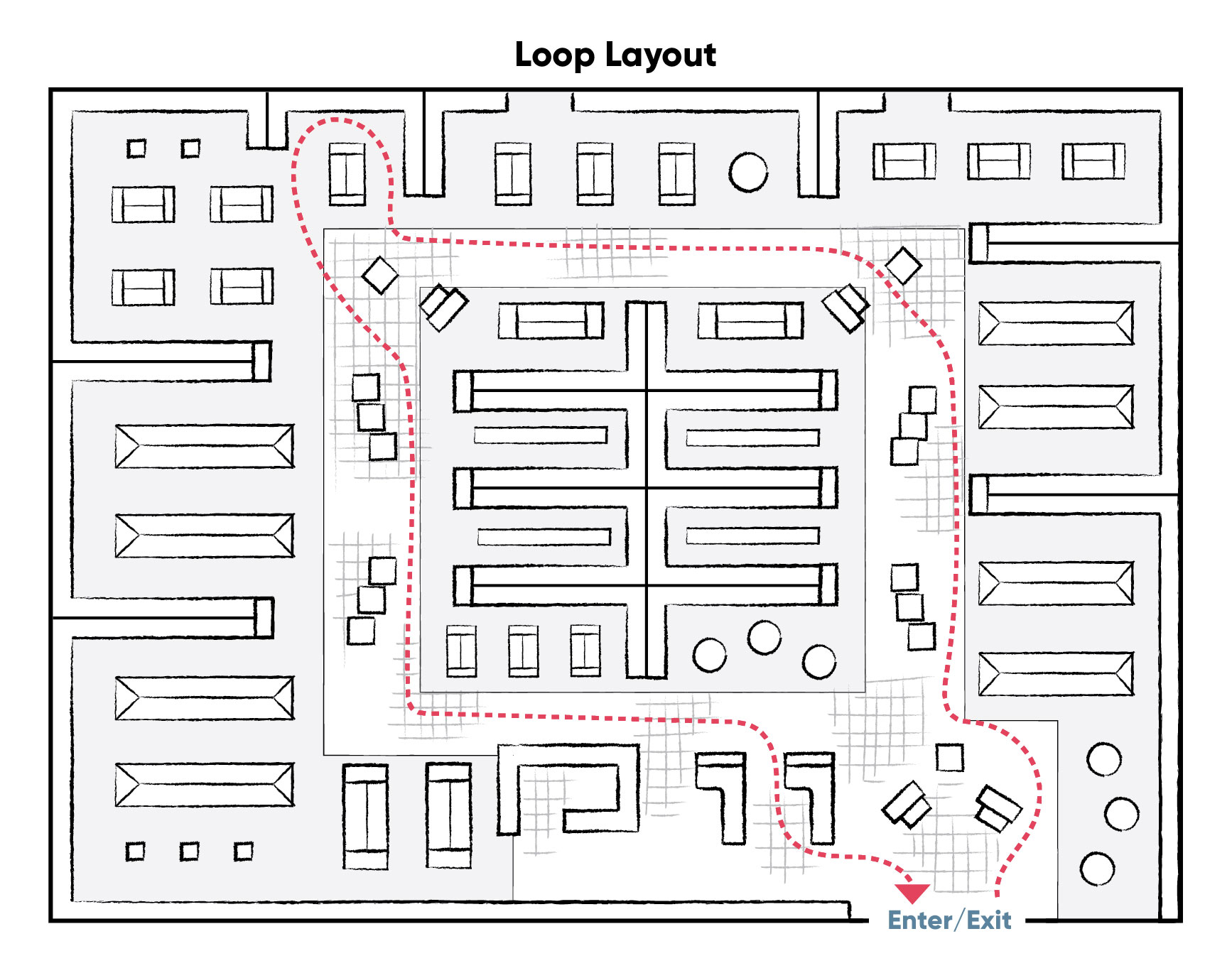 The loop store layout is a circular design that guides shoppers on a pre-determined path from the entrance of the store all the way through to the checkout area. It is well suited for larger retail spaces that feature multiple departments or product categories. This layout can be very versatile when using displays that can easily be repositioned; such as mobile gondolas, nesting tables, or small-footprint merchandisers. Place focal points within the main aisleway to provide inspiring visuals that will incentivize shoppers as they travel through your store.
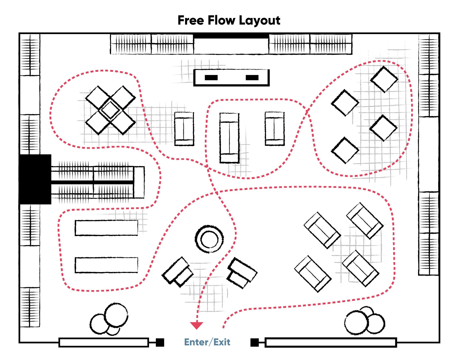 This type of plan promotes slow traffic flow by using unpredictable design patterns, displays, or signage. It’s best used when you want to encourage customer browsing and interaction with products. Your fixtures should be low standing so your employees can observe what customers are looking at, as well as, help customers with navigating the store or promoting the cross-sell of products.
Less is More
Sometimes you can achieve a bigger visual impact by putting fewer items on your displays rather than more. A visual display packed with items can clutter your customer’s mind but with fewer items, you have a better chance of enticing them to buy. Since space is directly correlated with a product’s value, overcrowded displays can make items seem less valuable or important. Keep your display clean and well organized with the corners and sides free of products. Start with two main items and add in a few related products.
Conclusion
Even with online sales steadily increasing, visual merchandising is still a dominant strategy for capturing sales. Your visual merchandising displays are meant to improve your customer’s shopping experience and at the same time encourage multiple purchases. Inspiring and creative visual displays can increase product turnover, strengthen your brand and encourage customer loyalty. By using racks, wall fixtures, tables, and lighting you can achieve these goals. If you would like information on our latest versatile fixtures, please feel free to contact us.
