How to Design an Exterior Store Layout + 8 Layout Examples
Your storefront is the first thing customers see. So why not treat it as an extension of what they’ll find inside? This guide covers everything you need to know about starting to design an exterior store layout. But first — let’s share some key information to get us going.
What do we mean by ‘exterior’? This is the area in front of the store that customers first see. It’s also the primary point of entering and exiting the store. It includes the sidewalk, windows, doors, cart corrals, and other fixtures.
Why is the exterior important? They say don’t judge a book by its cover, but that’s exactly what shoppers do when choosing stores to go into. Your exterior is like a welcome mat for your store. It sets the expectations of what they’ll find inside, plus they can learn about your brand just by looking at your storefront!
How should you use your store exterior? This is a great place to promote seasonal items or other products that are best suited for an outdoor environment. When developing your outdoor merchandising program, take your storefront size into consideration. For instance, is the space long or short, wide or narrow, covered or uncovered? All of these elements will dictate what is feasible given the space. More information on designing a layout based on these parameters will be covered in more detail later in this article.
With all of the above in mind, let’s look at some tips you can use to start designing your exterior store layout.
General Tips
Regardless of your store type or space size, there are a few general rules that will help you start maximizing your outdoor merchandising without a lot of planning or special fixtures. Here are some of our top tips for getting started right away.
- Avoid entirely unobstructed widows. Covering windows completely with displays can block natural light from entering the store. This can make your store appear darker inside, which could make customers feel uncomfortable while shopping.
- Make doorways easy to find. While merchandising your storefront can be a great billboard for what awaits inside, don’t make it a maze to get to the front door! Too much clutter in front of the door is also a safety hazard, so keep large, clear paths.
- Add dimension. Visual interest makes your space more exciting and eye-catching. Add dimension by using a mix of heights and display shapes.
- Sometimes less isn’t more. The layout and displays you use should be in proportion to the available space of your exterior. One or two displays may not make much of a splash if the sidewalk space is rather long. Choose enough displays that make sense to the size of your space.
- Don’t be afraid to step away from the wall. Pushing everything up against the wall is a great way to utilize sidewalk space. But if possible, use freestanding displays to bring displays out closer to where the customer approaches. This will help highlight it as important and won’t get overlooked in the background. Plus, customers can more easily shop all sides of the display.
Sample Exterior Layouts for Inspiration
Want to see what some of our tips look like in action? Here’s a quick look at how other stores are investing in outdoor merchandising.
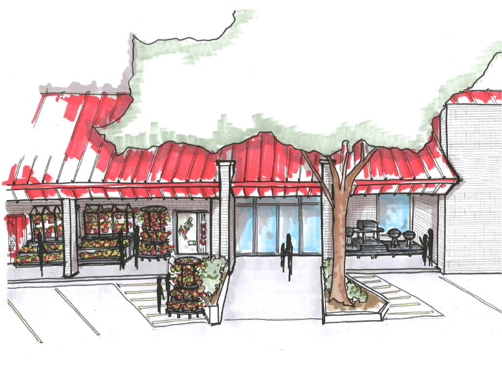
Example 1: Small format specialty store with a covered narrow walkway
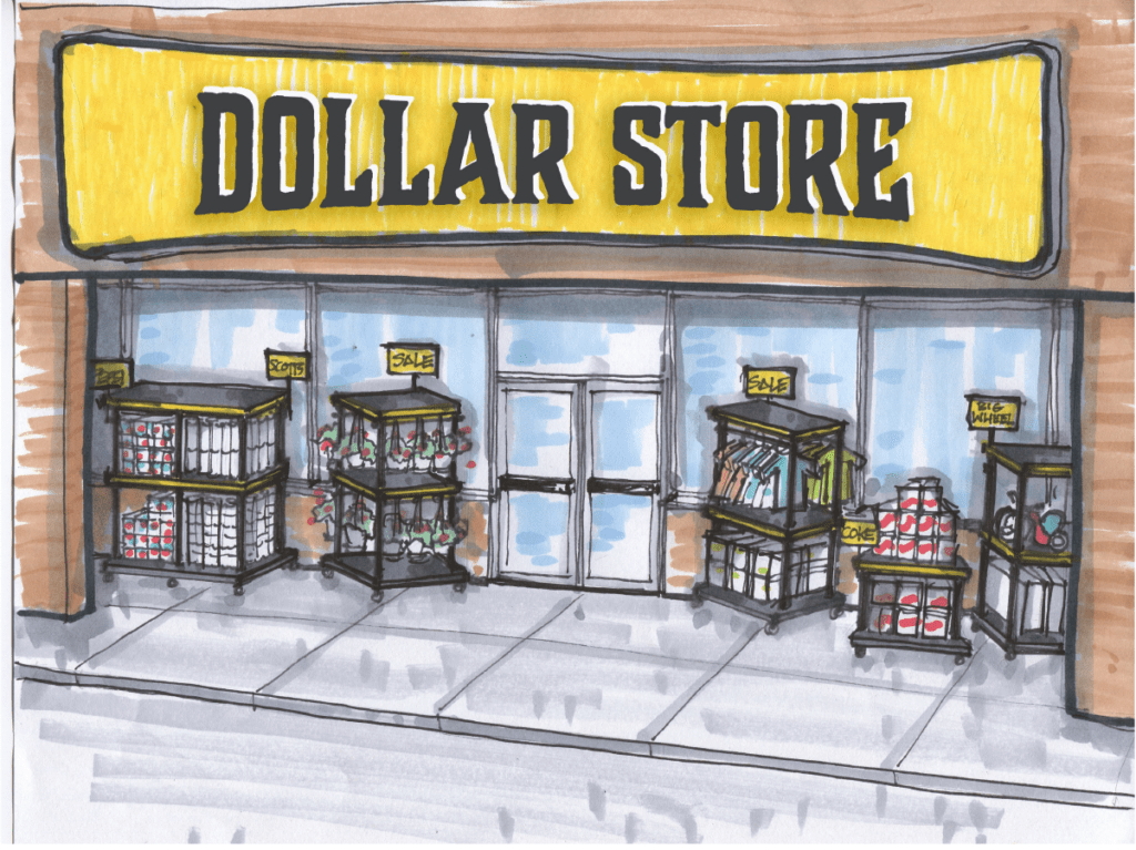
This is a great layout example for retailers located in strip malls. Here, you can use the outside of your store for clearance items or special buys. In the example photo, the retailers uses multi-tier and multi-functional displays for a multitude of products. Notice the displays are also mobile to roll back into stores during off-hours. Another benefit is the ability to expand or condense the layout as needed — the small footprints of each display work well together.
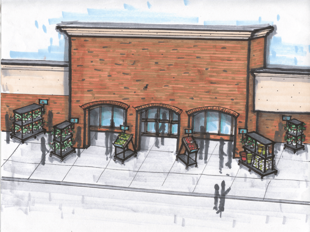
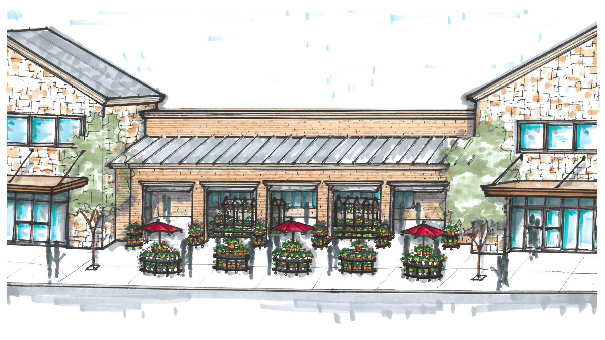
Example 2: Stores with multiple entrances near each other
Here’s an example of displays that point someone towards the door’s entry. Notice a runway effect and a variety of heights, with the highest point closest to the door.
Here’s another example that’s more practical because it displays more products in a smaller space. There are fewer displays here, which helps to keep your merchandising costs lower while also allowing for more products. Similar to the first example, these smaller displays point towards the center and main entry points.
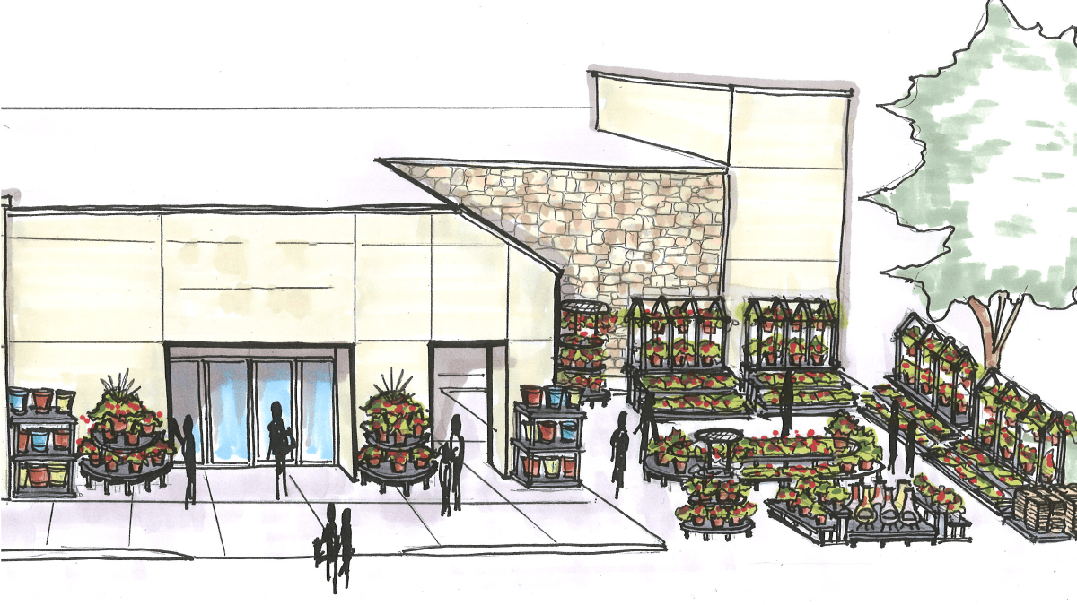
Example 3: Large format stores with unique architectural storefronts
This storefront display setup blends well with its environment. When dealing with architectural elements like awnings and landscaping, it can be hard to figure out how to place displays so they won’t be overlooked and won’t clash with existing elements. This display setup works well because parking spaces meet the front sidewalk and there is a designated path to the door. The taller displays have multiple levels to create visual interest and draw the eye.
This example poses more challenges due to the pre-built streetscapes. Here, the largest and tallest displays are placed under the awning to the right of the main entrance, mirroring the streetscapes. Smaller round and half-round displays are used as beacons that will lead the customer’s eye to the larger set of displays.
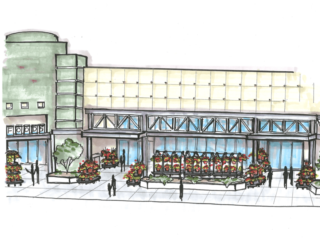
Example 4: Large scale destination merchandising programs
For stores with ample space at the front of their store, larger merchandising programs are a great idea. The above example helps retailers create a whole separate destination that is more than simply impulse.
This store has an alcove near the front of the store that is framed using taller displays, with shorter tiered displays filling in the center of the area. It’s positioned in a circular pattern to entice browsing and creates easier navigation back to the main entrance.
The second example is for retailers with multiple entrances that are farther away from each other (think Home Depot, Lowe’s, etc.). This often leaves the center of the building looking bare and void. By using this space for merchandise, retailers can dress it up so it becomes more of a focal point. This example layout uses taller displays against the back walls and shorter round displays towards the front. There are also stepped displays acting as end caps for each of the pillars. The roundness of the front displays won’t feel like a wall and will encourage customers to browse from display to display. The end caps will also aid in pulling people towards the back displays.
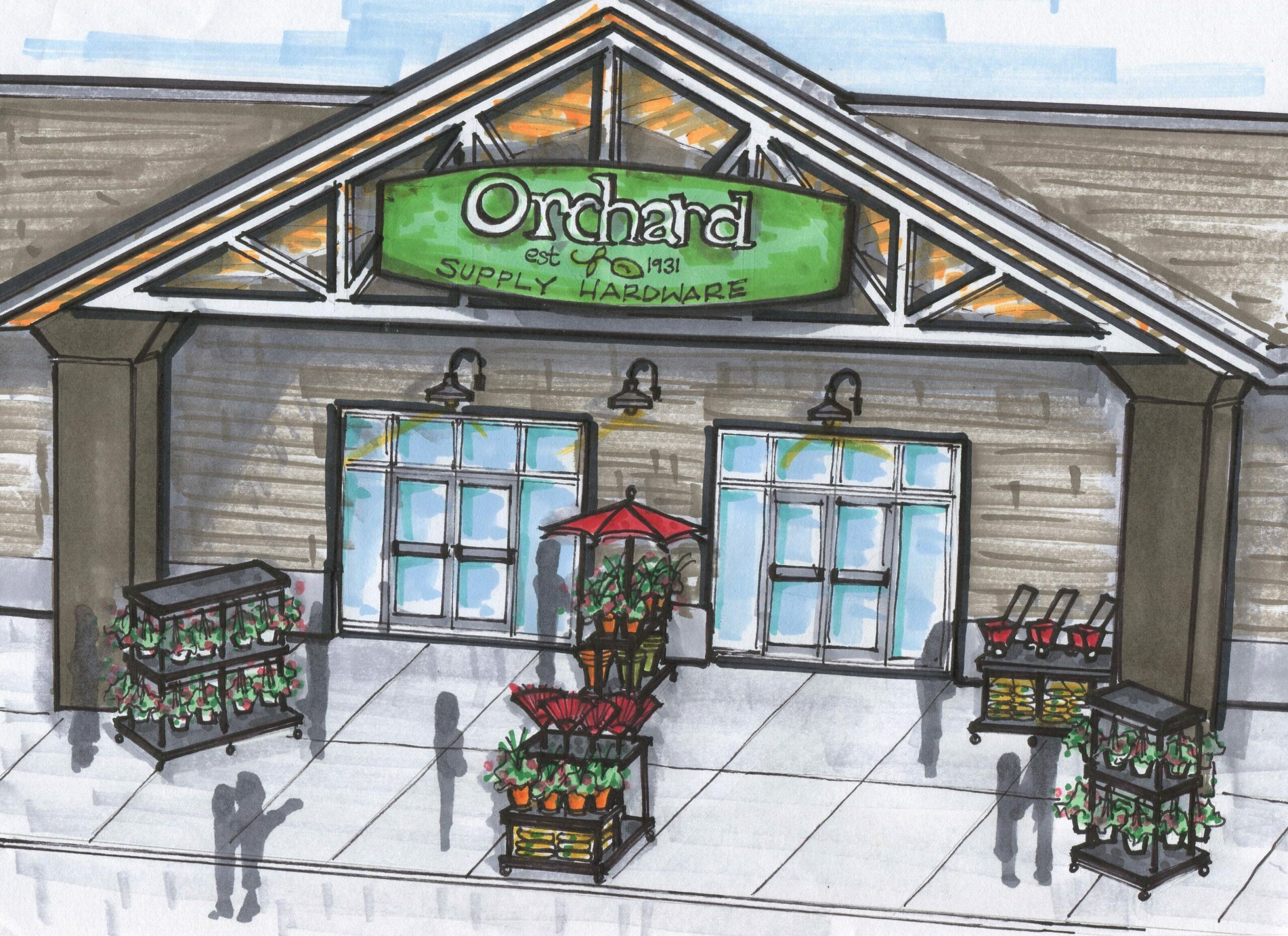
Example 5: Small format covered porch
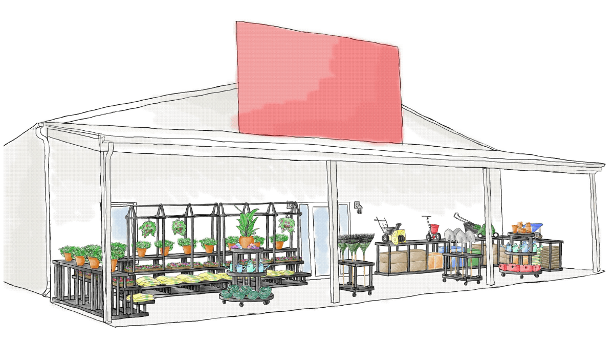
This is a common storefront style at garden centers or hardware stores. The narrow covered areas need to be multi-faceted and hold various products. This layout example uses a variety of longer displays against the wall, while smaller mobile displays sit towards the front. These smaller displays are great for expanding the space outwards on nice weather days or to make more room on busier days.
Wrap Up
Taking advantage of every bit of retail space means thinking outside the walls. You can maximize your storefront space in unique ways to encourage impulse purchases and even create entire shopping experiences.
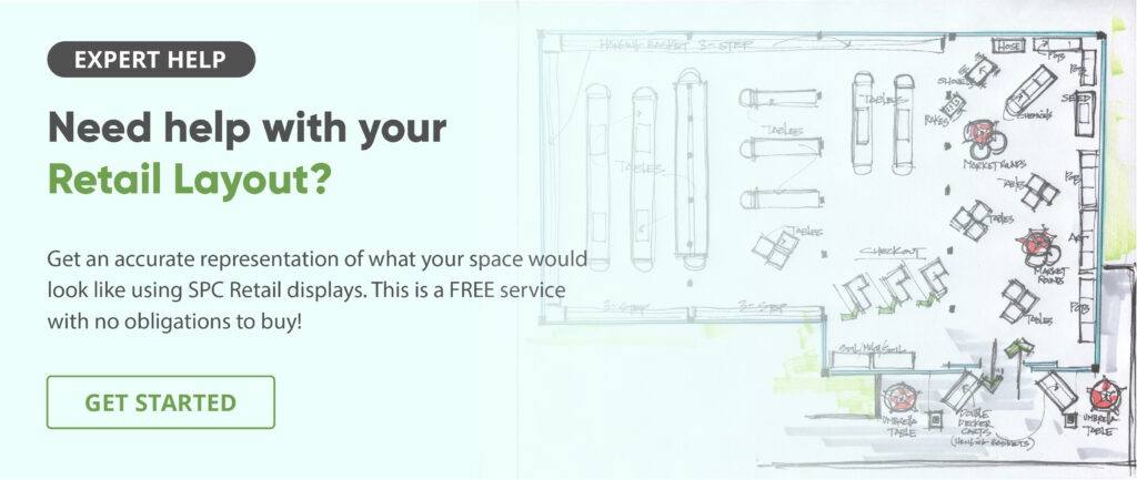
If you’re looking to revamp your storefront exterior, SPC offers free layout design to our customers. We can help you visualize your space while ensuring adherence to the best practices discussed in this article. If you’re interested, request a consultation and we’ll get started crafting a layout that works for your store format!