Elevate Your In-Store Product Presence with These 5 Game Changing Tips
In today’s bustling marketplace, grabbing your customers’ attention is more challenging than ever. As you design your retail space with strategic fixtures, remember that shoppers are constantly bombarded with distractions—from their smartphones to endless shopping options and the demands of multitasking. To stand out, enhancing your in-store product visibility strategy and making your store an irresistible destination is essential.
What is Product Visibility?
This is the ability for shoppers to discover, identify, and engage with products. You make this possible by placing emphasis on inspiration per square foot, as opposed to the old store metric of sales per square foot.
As the curator of your customer’s shopping experience, you need to look for ways to make your displays more noticeable and engaging by thinking about the experience you want to provide them.
There are two major things that play a large role in product visibility: Where a product is located in the store, and how the product is presented to the shopper.
Here are five ways you can improve in-store product visibility and guarantee greater retail sales.
1. Maximize Sight Lines & Focal Points
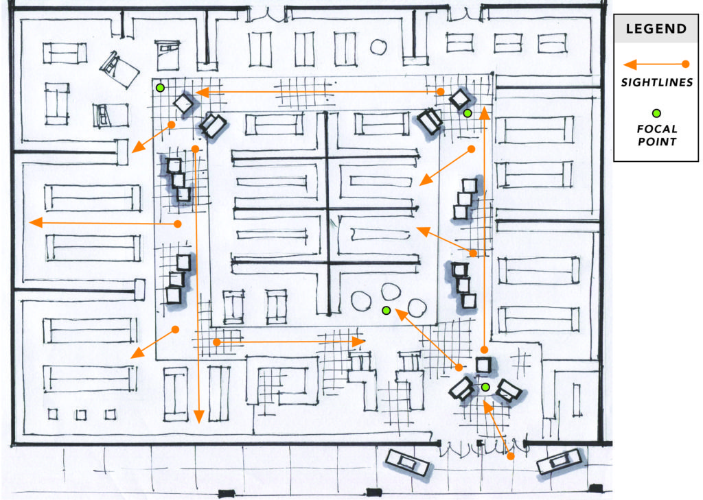
Sight Lines are the natural point that your eyes are drawn to as you navigate a store. Keep in mind the eye level of your potential customer, and think of what you want them to see–both as they enter, and exit your shop. Keeping the most relevant and attractive products on that sightline will keep them interested throughout the entire shopping experience.
Focal Points are the location at the end of the sightlines. Draw your shoppers to the Focal Point by showing the most enticing products there, such as a special offer, or a themed display. Set up well-lit, 360-degree focal points that are balanced and shoppable from all angles.
When planning the layout of your retail store fixtures, put yourself in your customer’s shoes and shop the store from their perspective. Is it easy to see around your store? Can you easily find and navigate the various product categories? Is fixture placement blocking the product? Stand in key areas of the store such as entrances, exits, check-out, and aisle intersections and conduct a visual audit of the store.
Make sightlines as long as possible. Sightlines play a vital role in how a customer will travel through your store. Choppy, obscured views often make people feel unsettled, even if we can’t put a finger on why. In contrast, clear sightlines are calming and we’re more likely to find them aesthetically pleasing.
2. Create Different Selling Levels
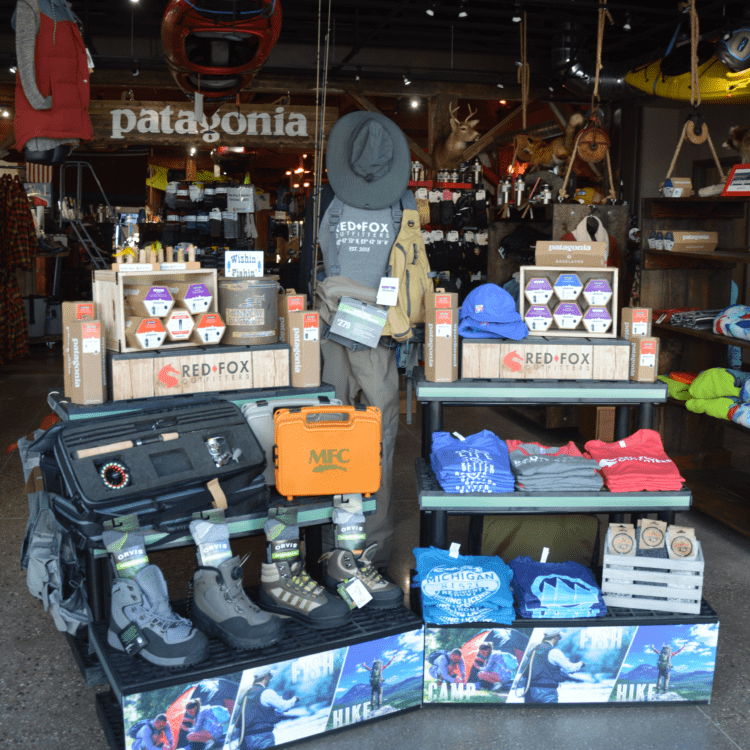
Using a tiered display, such as our 3-Step Pyramid or 4-Tiered Round, allows you to display more merchandise without taking up more floor space. Be smart about how you position your products: Use smaller tiers to promote accessories or coordinate products.
Products positioned at eye level are more likely to be noticed by shoppers. Keep high-profit items on primary levels and complementary or lower-priced items on levels above or below the showcased product.
3. Tilt Product Up
Here’s a great designer tip: by placing a product on a 15-degree slant, you improve product visibility by an average of 27%. The better you can showcase a product’s full potential, the better your shopper’s experience.
A study done by Raymond Burke of Indiana University showed that this was vital to shoppers who might be “just browsing”. A product’s shelf position, appearance, and presentation are essential to engaging shoppers and can be what makes them change their minds about making a purchase.
A slanted merchandising strategy widely utilized by grocery, drug, and specialty retailers for decades is now easily achievable using our Tilt-Top Display System. It turns our traditional flat display tables into an engaging focal point that promotes customer engagement.

4. Create Blocks of Vibrant Color
Did you know that color has a direct psychological impact on shopping behavior? This is why retail designers use the power of “color blocking,” to attract more customers.
Color blocking is a method that combines multiple solid colors, usually in bold and bright shades. Retailers say that color is seasonal. If you can match your displays to reflect the season, you may have more success! Try darker colors in the winter, and lighter colors during summer and spring. Play with changing hues in Autumn, as the natural desire to shift and change may have an effect on your shoppers’ moods.
If you organize products by color, these slight details will encourage customers to look through more stock. So don’t skip over this part of your retail display. The order of the colors also has a way of making them notice and purchase products that would otherwise be ignored.
5. Keep Products within Reach
Customers shouldn’t have to bother tracking down an associate to get their hands on a product. Always make sure the most attractive products are stocked and within reach of your clients.
Keep display stands shelf height at a maximum of 60 inches. This ensures shopper safety and minimizes the risk of any hazards or safety concerns if people have to climb around or reach over other shoppers’ heads to get the product.
The shoppable depth of a fixture should be 36 inches or less. This keeps the product within the shoppers’ reach without them having to strain or bend forward too much to engage with the product.
Improving your In-Store Product Visibility is never time-wasted. How can you tweak your retail store fixtures to appeal to your ideal shopper? If you learn to improve what works, you’ll be able to improve the shopping experience and attract more clients to your store.
Elevate Your Merchandise With SPC Retail®
Unlock your store’s full potential by incorporating an SPC Retail® display into your layout. Engaging your customers starts with choosing versatile displays that will grab their attention while pulling your product out of the shadows! With various fixtures to choose from, our displays are made from 100% recycled plastic, can be used indoors or outdoors, and are easy to set up and tear down. Visit our website to learn more about our product offerings.
